

From your phone, you can complete all the forms and health screeners that would be required before a visit at a doctor's office. This eliminates the need for sitting in a doctor's office to fill out paperwork on a clipboard. For the front office of a clinician's practice, the staff no longer needs to manually enter information from paperwork into the electronic health records (EHR) software; it is automatically updated in the patient's file when they submit the information in the mobile web app.
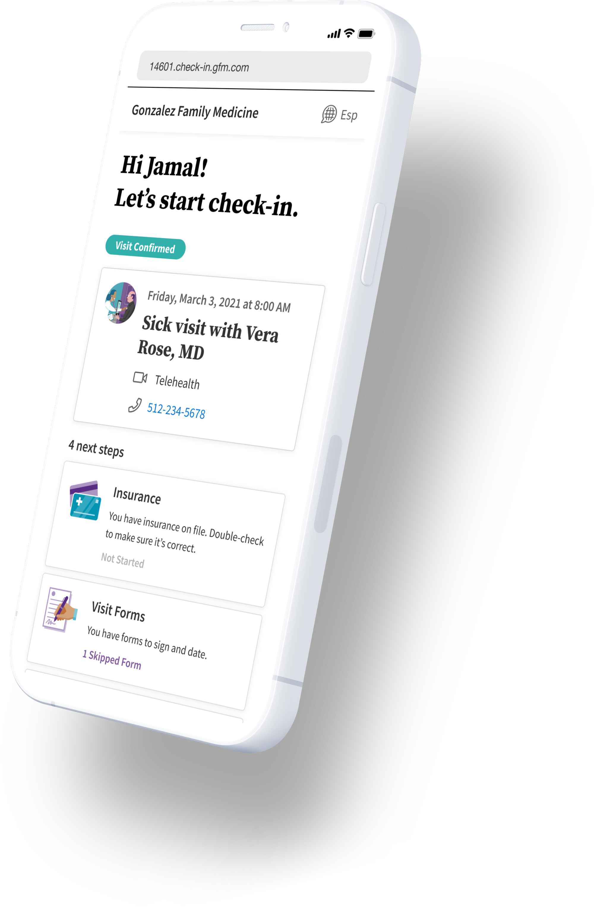
The user will receive a link to start the check-in process. Depending on the healthcare provider, they could receive this weeks or days in advance.
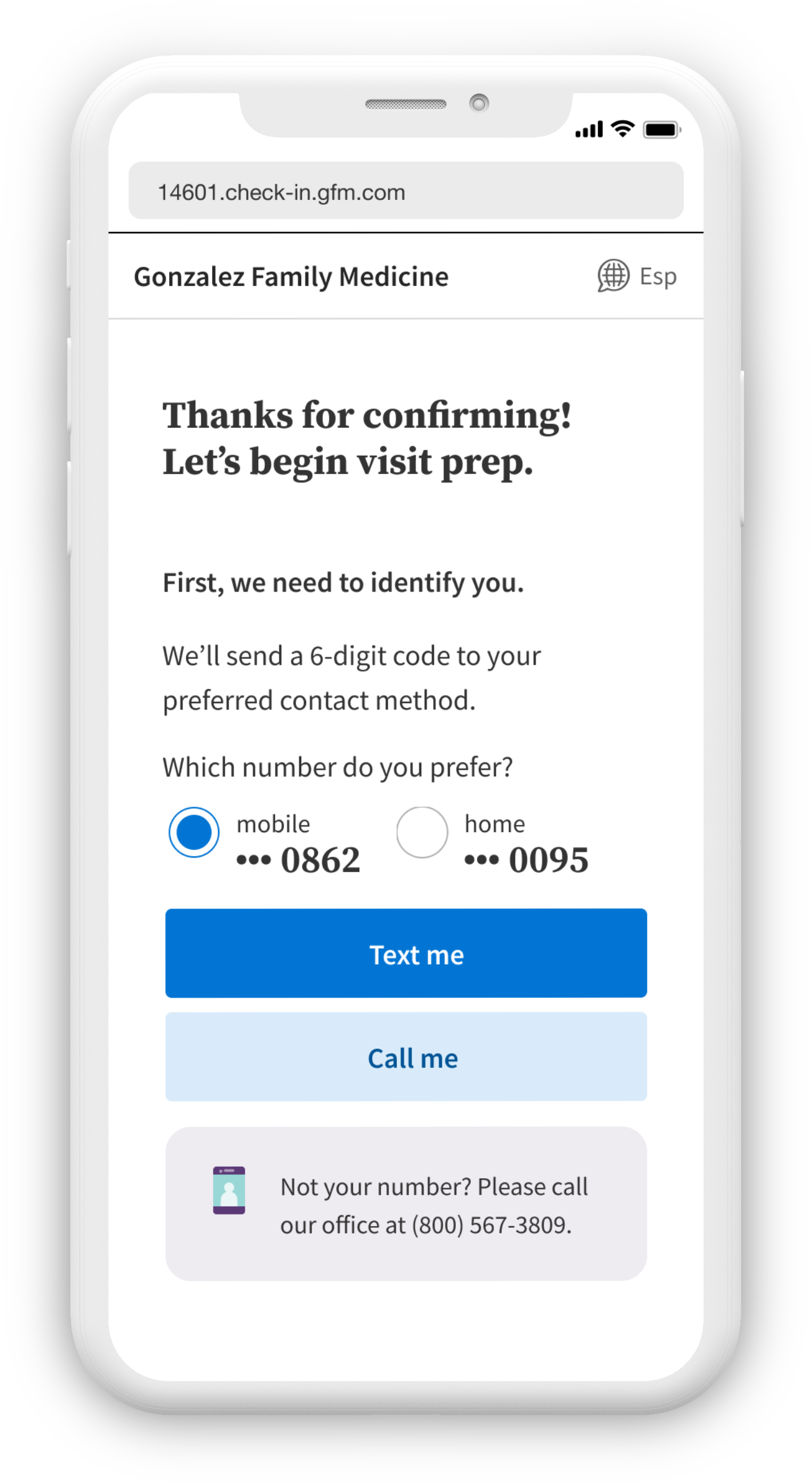
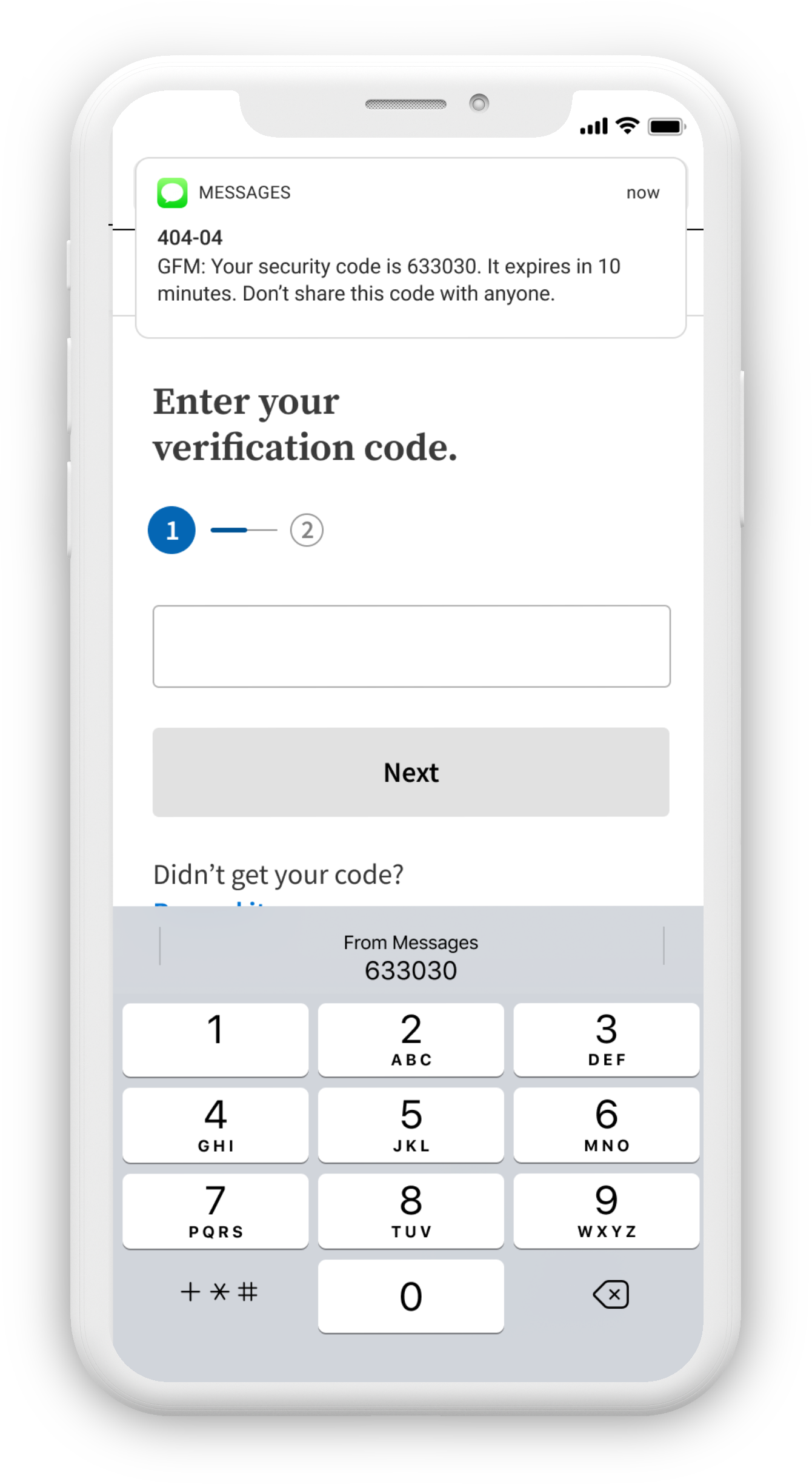
Because patient verification is essential, they must use their phone or email to verify their identity. In this case, the patient chose to receive a text message. They must enter in the code to continue.
After their identity has been verified, the user can start the check-in process. If the user is an existing patient, some forms and information are already in the system. The user can choose to do any of the steps in this process in any order, as overwhelmingly desired by users when we tested different interface options.
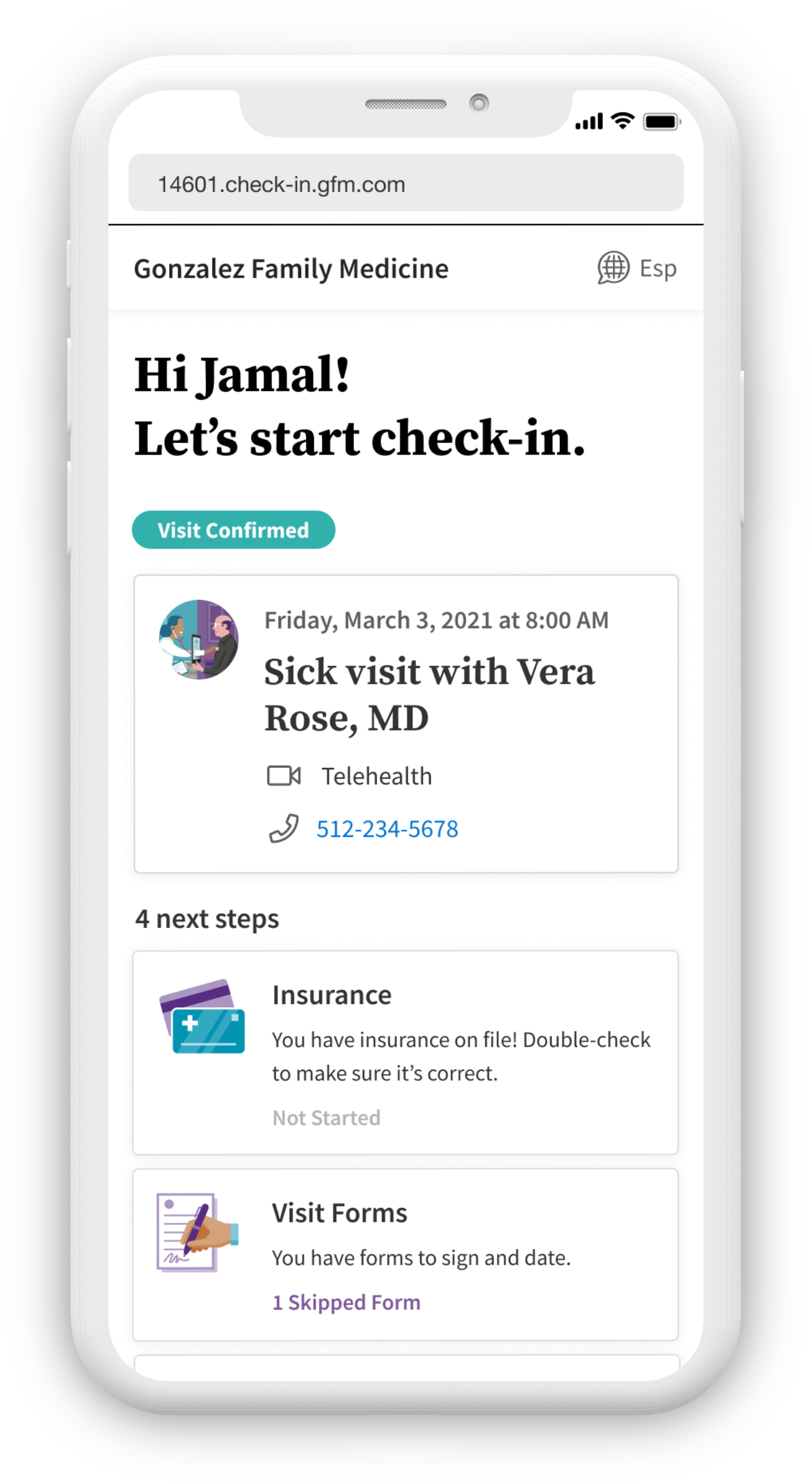
In this scenario (which is the most frequent scenario), a user already has insurance added to their patient record and only needs to confirm it by clicking "No changes". However, there are other cases where a user might need to change their insurance or needs to add insurance.
View prototype for adding insurance ⟶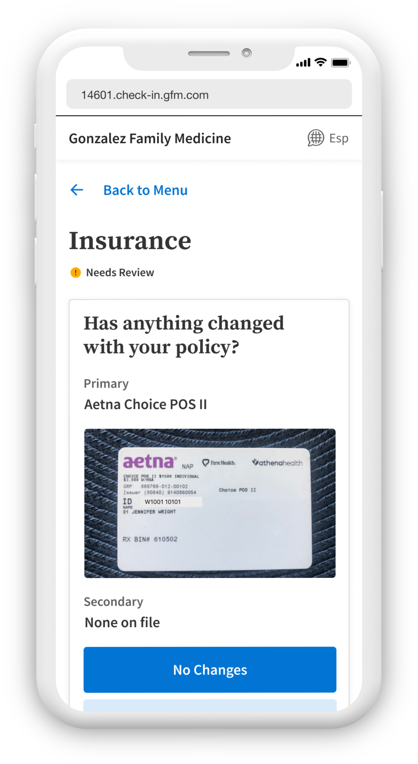
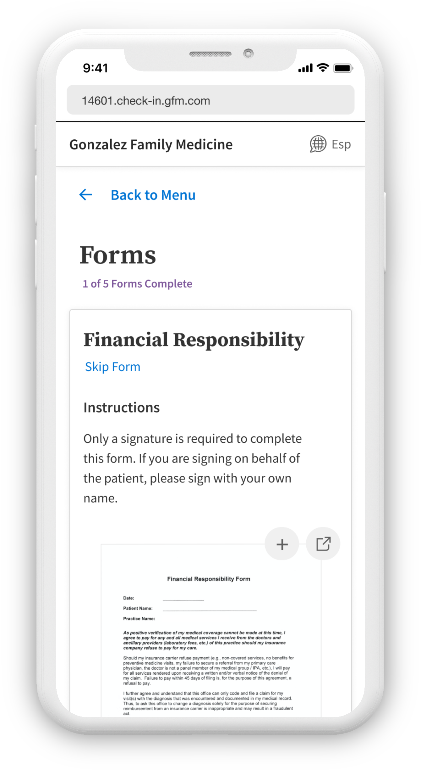
Digitizing paper forms like the Financial Responsibility form is one of the most complex parts of the check-in experience. For our first release, only forms that require signatures will be allowed by the app. In the future, forms with fields the user must fill out will be an option.
Assessments (or health screeners) help a medical provider understand if a patient might have depression, anxiety, or a substance abuse issue. These are tests that are almost always multiple choice. In the background, a score is given to the provider that determines the patient's risk for a disorder.
View prototype for taking an assessment⟶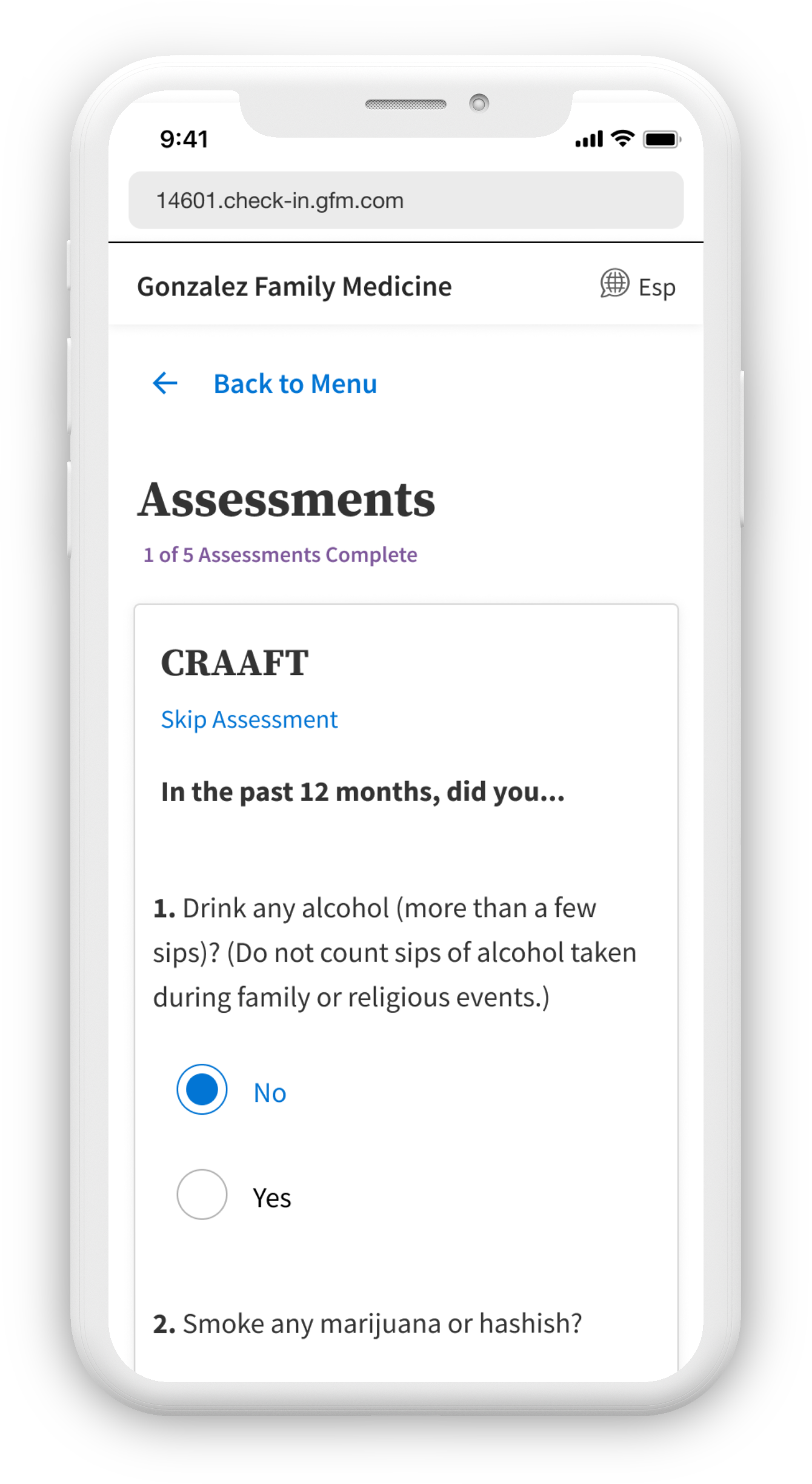
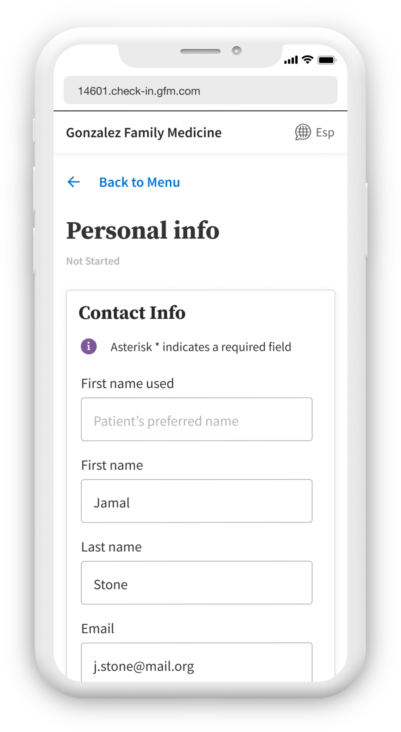
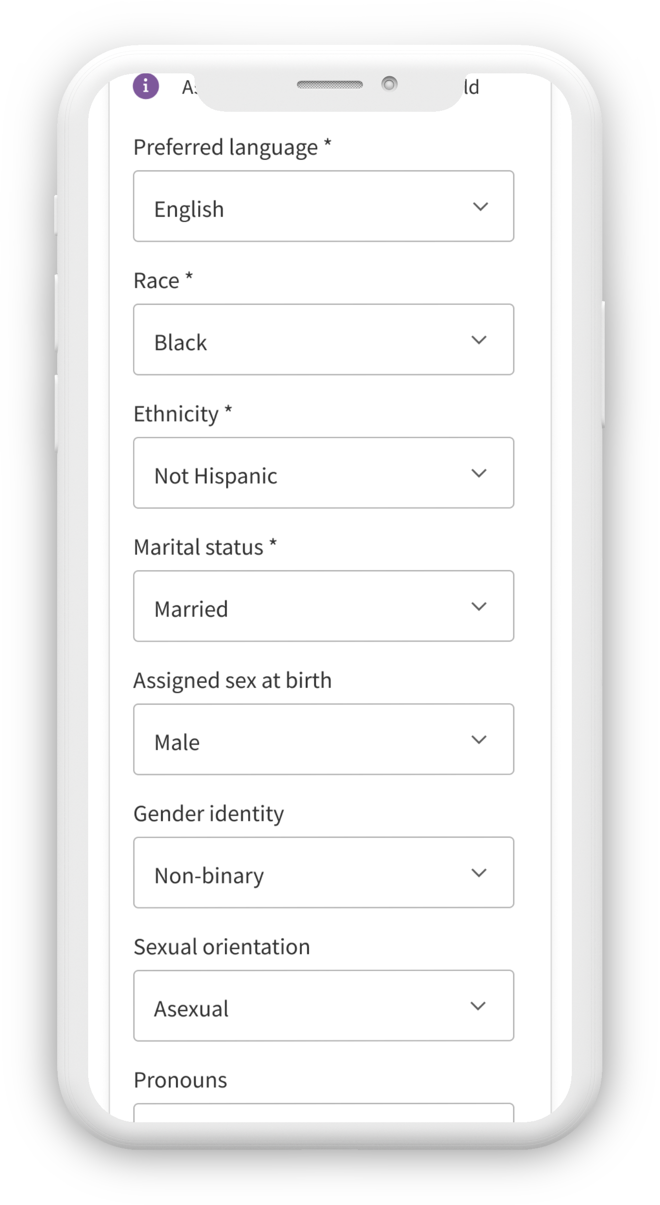
In this section, the user can update their personal information, such as their address, phone number, and gender identity.
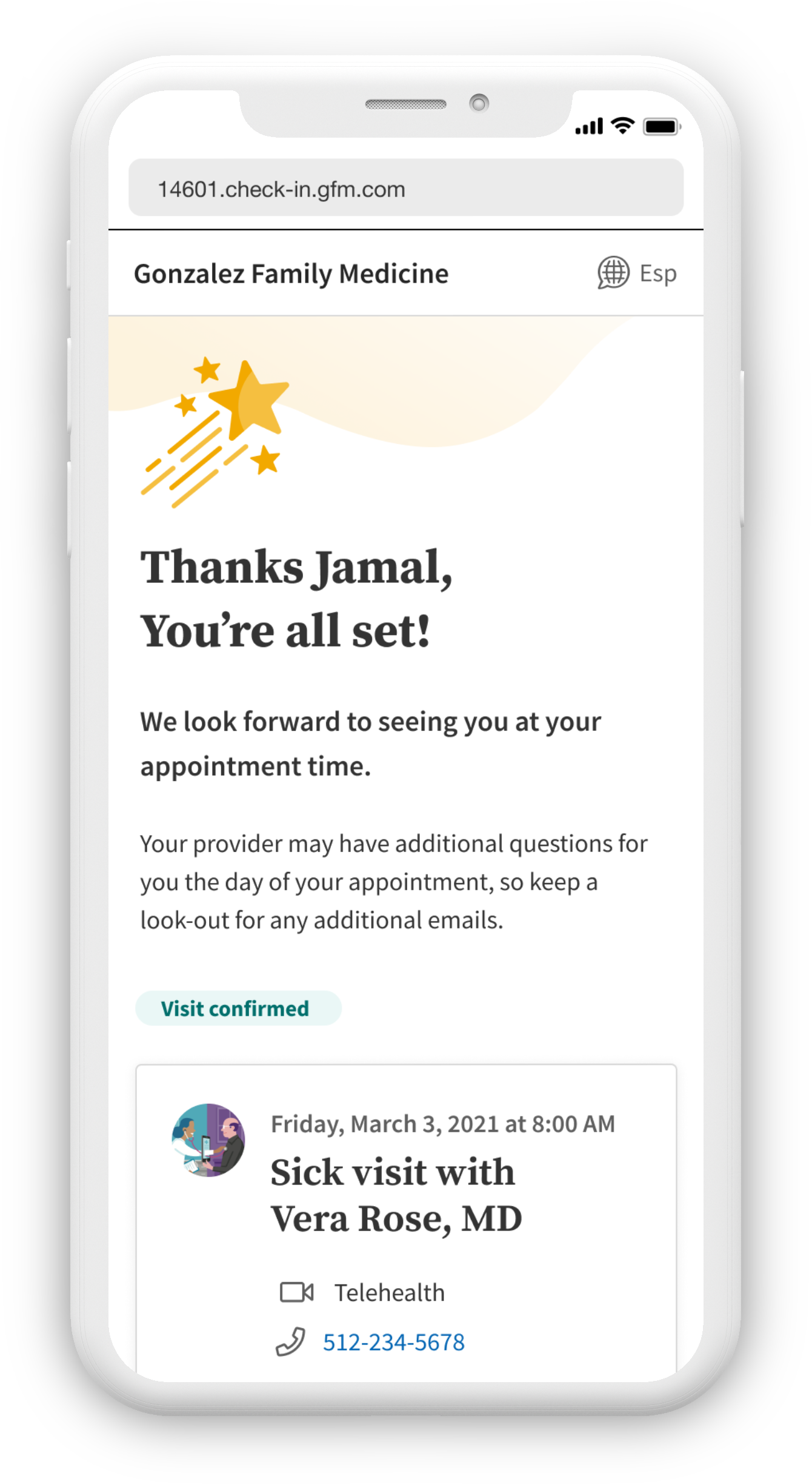
After every section is complete, the user will receive a congratulatory message indicating they're ready for their appointment. If the patient did not complete everything by check-in, it is up to the provider's office on how they want to handle this.
This is the happy path of the check-in experience. It does not account for all the potential error states, checking-in for a minor under 18, and the desktop experience. Feel free to email me for access to the Figma file to see more states.
The MVP of this check-in experience will be released in Q3, where we will use in-app analytics and discussions scheduled with practices to get their feedback. The MVP only contains the Visit Forms and Personal Info sections. Thus far, we have tested prototypes of the check-in experience with patients using UserTesting with a 96% positive feedback rating. We have also demonstrated the prototype to medical practices throughout the US to gather their sentiment with positive feedback.
The entire check-in experience is WCAG 2.1 compliant, which will be verified by a third-party company after release. In addition, we ensured that the language and options we display in the app are inclusive of the LGBTQIA+ commmunity.
If a patient uses a name other than what is on their legal documents, they may indicate what their name is to their provider. We are currently working on a better term than "preferred name".
Patients can indicate their gender identity, sexual orientation, and pronouns. If their gender identity, sexual orientation, and pronouns are not available in our system, they can type in their information to accurately describe themselves.
During the discovery phase of the project, I was tasked with figuring out how users like to enter information. In this case, did they prefer a linear model or a hub-and-spoke model where they could choose which order to fill out information? I created prototypes and a user test via UserTesting.com where the hub-and-spoke model was liked by 86% of participants and 46% would complete it immediately, opposed to 80% of participants liked by participants but only 33% would complete it immediately.
I handed off this research to another designer and I was away from the project for a few months.
Upon being reassigned this project, I immediately asked the departing designer for all the information she could give me and worked on integrating myself into the team. She had already conducted research on the insurance card section and so I used this to inform my decisions on designing for collecting insurance information. I worked on a user test for Assessments, trying to understand how people like taking online quizzes. I used the information I learned from this test to inform my design, such as putting the entire assessment on one page.
Meanwhile, I work with the developers and product manager to design ahead of development while coming up with on-the-fly solutions to minor edge cases. Once the check-in is released as an MVP, I plan to use data captured by integrated analytics collection to understand where users might be getting stuck or how long it is taking them to do certain sections. We are also planning a minor visual update and improved clarity for the next version of check-in.
Note: Research materials for this project contained patient-protected info (PPI) and private practice info, therefore it is a violation of HIPAA to display them in any manner. The amount of information I can discuss is limited.
While I initially started on this project in its discovery phase, I was assigned to other work at the beginning of development. I was reassigned this project four months later, so I had to integrate myself into the development team and bring myself up to speed on their work. I became a fully integrated part of the team, working with front-end developers through edge cases, error states, and other potential technical glitches. I attend all of their Scrum meetings and I am their UX person to go to in regards to anything about the check-in experience. Meanwhile, I collaborate with the product owner to design ahead of development so that new sections and screens are ready months in advance before development needs them.
After being away from this project for a few months, it was a bit hard to catch up with what had happened. The design I left the team with had drastically changed. However, I was able to schedule several meetings with the departing UX designer on their team and learn everything I could about what had changed before she left. One unexpected challenge I faced was helping define roles on the team and to help associate front-end developers understand the division and similarities of front-end development and UX design. I aimed to involve front-end developers more into the design process so that I could get a general idea of what limitations they might face with my designs. Although it was released after I left athenahealth, I was able to see the final product and my vision was realized.