

In our research, we identified that users had trouble finding information in the Learning Center. It was also extremely outdated in its visuals, so most users found it unpleasant to look at.
Collaborating with a company focused on creating help platforms, we redesigned the Learning Center to look more like our product, while trying to maintain the structure of the NaviPlan so that topics were easier to find.
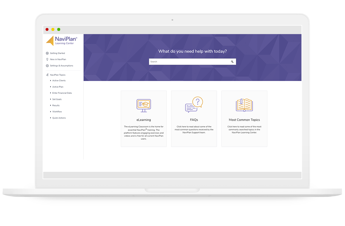
Previously, users had been bombarded with a giant list of topics and no way to search for subjects. Search was a highly requested feature, so we made it front and center of our new landing page
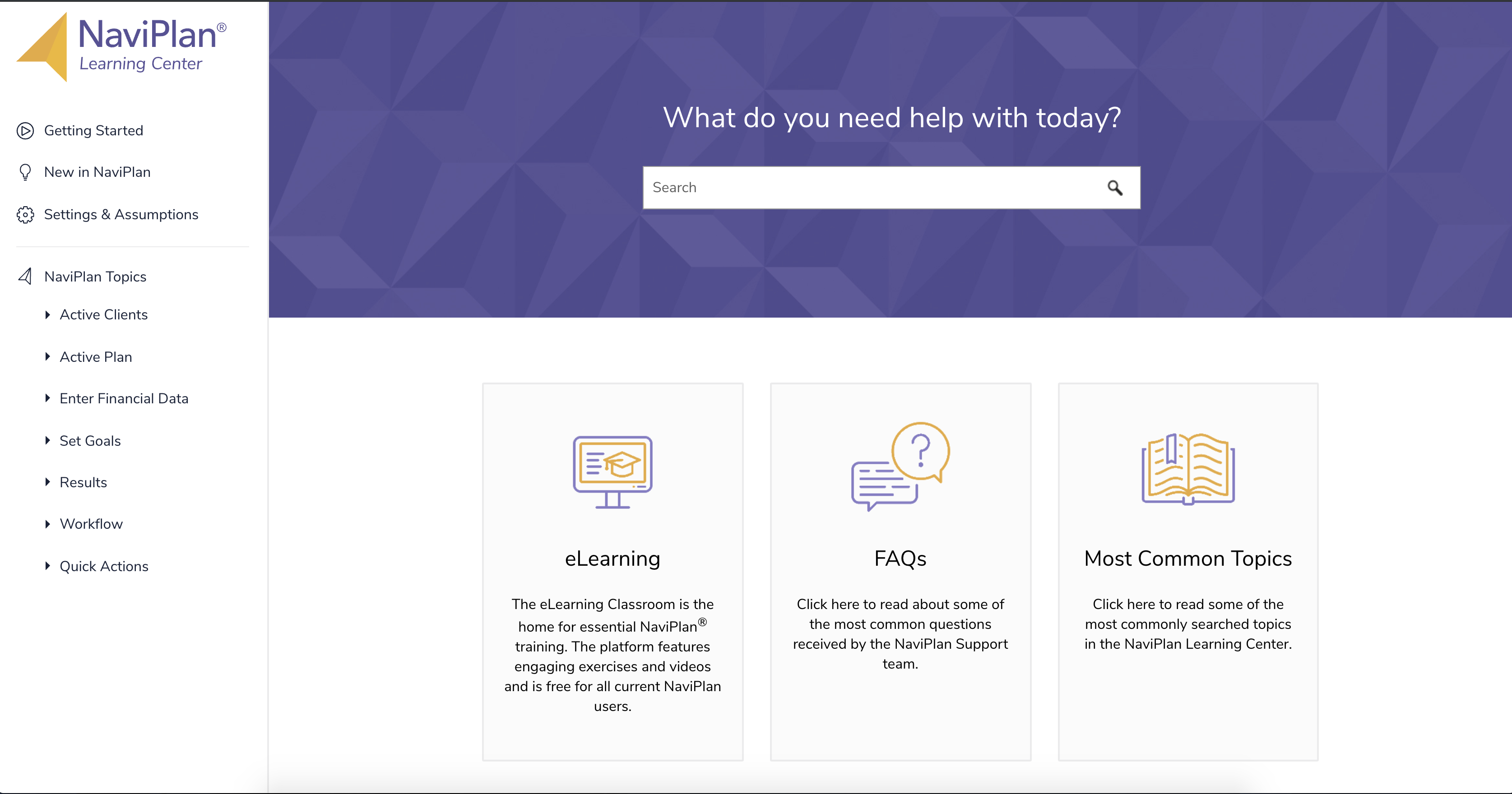
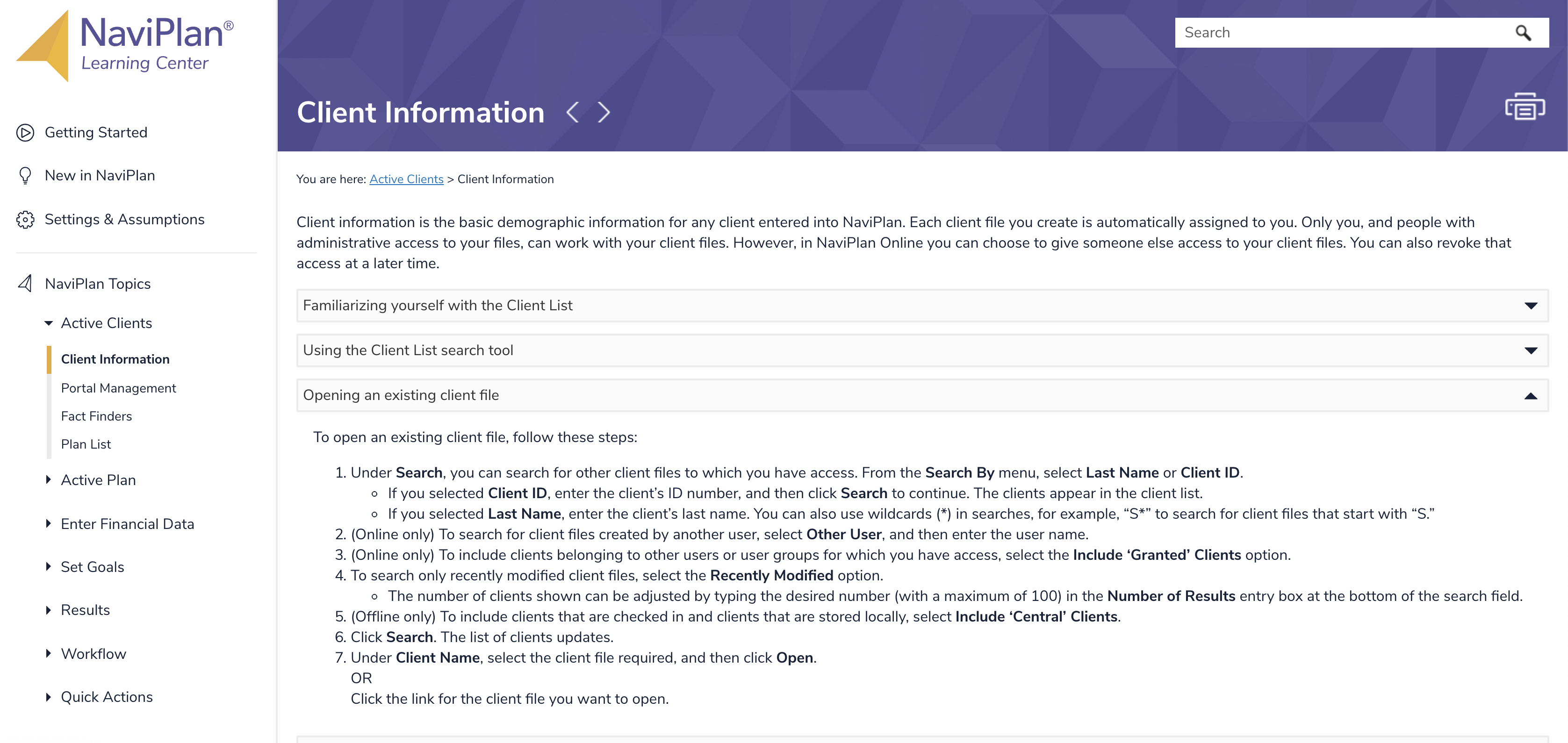
Information is more easily scannable by having sections in collapsible accordions. The section headers represent tasks an advisor typically wants to do.
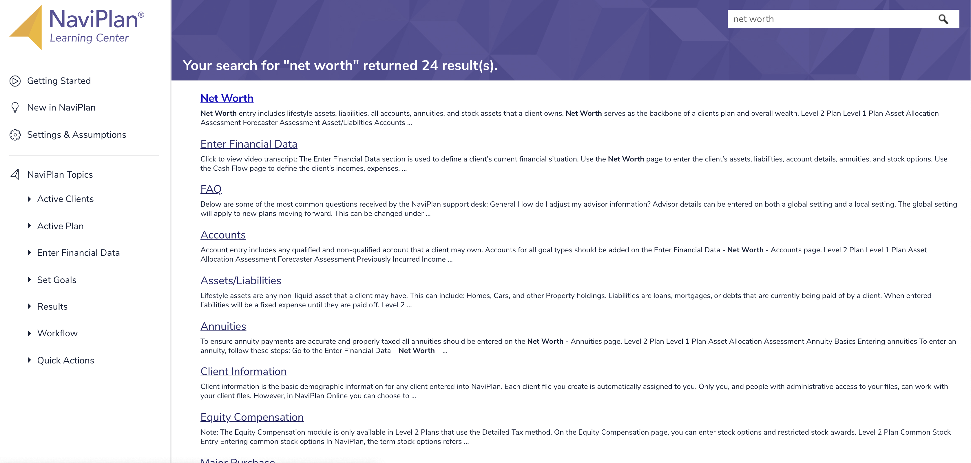
The new search function can scan through all Learning Center topics and sorts the most popular topics towards the top.
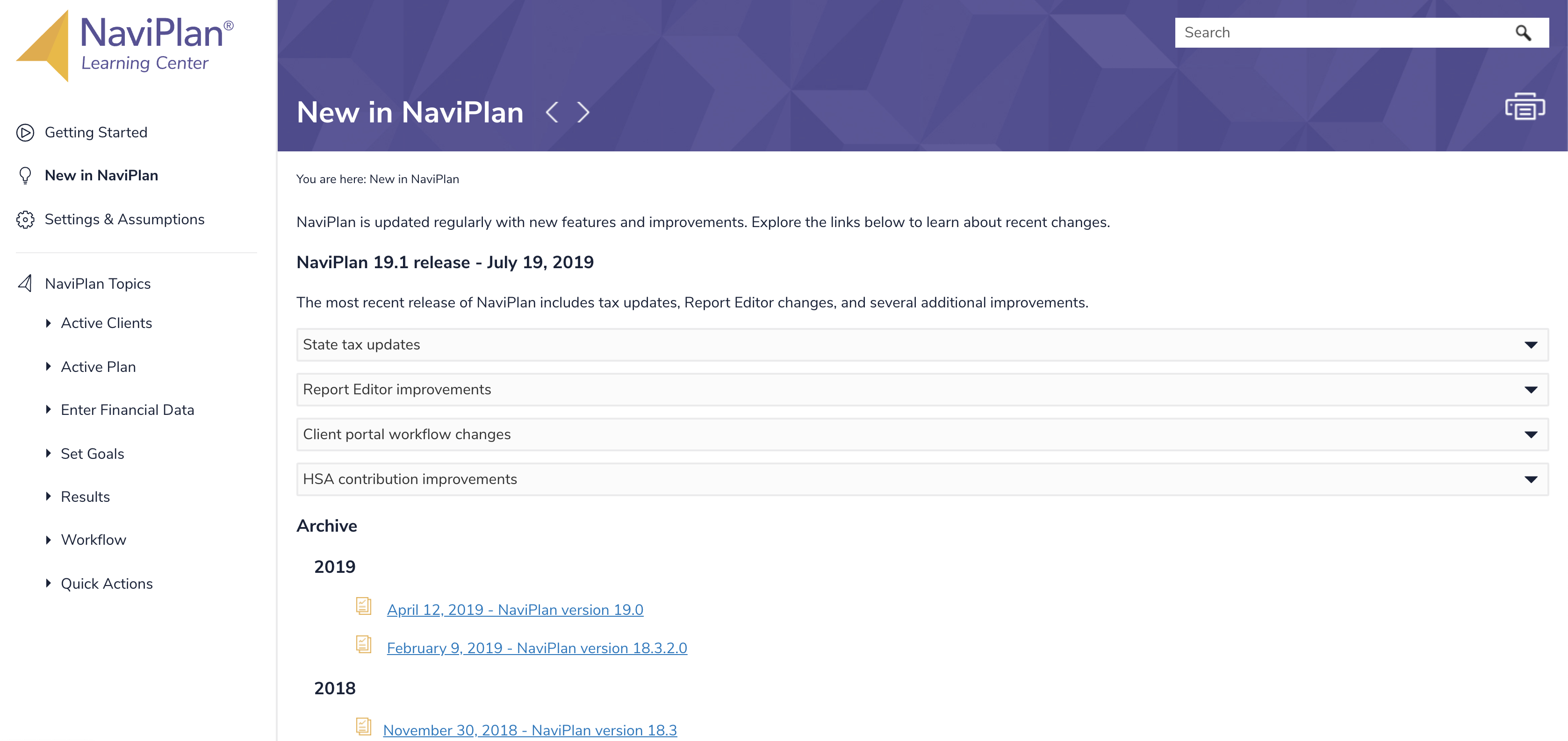
Advisors often use release notes to understand if the software has implemented new tax laws that go into effect throughout the year or to understand if there's been requested feature updates.
Through using Pendo, we were able to gather metrics on visitors to the Learning Center. In the first week, we had a 100% increase in visitors. I designed a modal using Pendo that popped up within the software that informed users of the new Learning Center, which resulted in a click-through rate of 76%. We are still measuring the impact on support calls.
I collaborated with the internal Learning Development team, who has expertise in creating help documents for our complex software. They had access to an abundance of research detailing how our users utilize help documents and features they were looking for in a revised Learning Center.
After our collaboration, we entered a partnership with a company focused on creating help websites and I was in charge of doing design reviews during all parts of development to ensure we delivered a consistent product that matched our branding and internal design system.
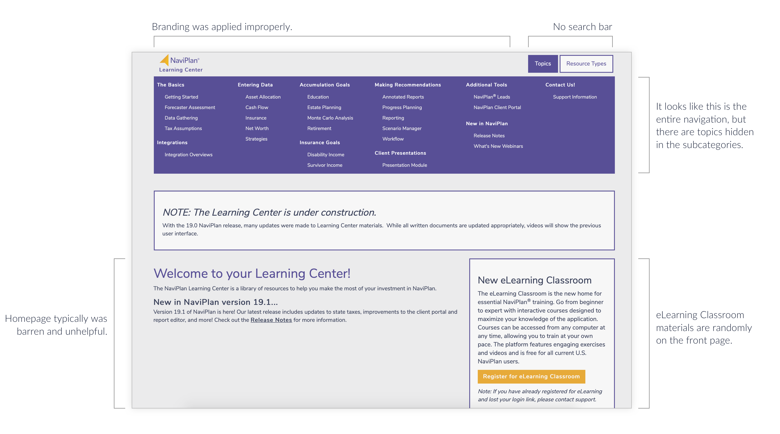
Through the use of a survey, we identified that 85% of users who use the Learning Center said that it took too long to find information. Considering the lack of search functionality or structured navigation, this makes sense.
"The biggest issue for me is that there isn't an effective search function. It can be difficult to find material unless I can guess the exact term thattitles the article in Learning Center."
Through the use of a survey, we also identified that 41% of users did not use the Learning Center. 79% of those users were unaware that the Learning Center existed. This will be addressed in Phase 2 of the update. We wanted to ensure that the Learning Center experience was positive before trying to attract unaware users.
I had to learn to settle for design decisions that were impossible to execute due to the third-party help website software. While it is greatly desired that all of our user-facing software has identical design elements, some sacrifices had to be made wisely, such as animations and using breadcrumbs in the header.
Part of this project required approval from Marketing before the final product was shipped. Marketing had to be convinced that our reluctance to put videos about unimportant topics (e.g. a "How to use the Learning Center" video tutorial) would lower confidence in the user that the improved Learning Center was easy to use. I understood why Marketing believed in the importance of videos, but it was also a learning experience about selling UX to people who might not understand it.
Regardless, I learned how to take limitations and create something that looks as close as possible to our main product. I am excited to work on the next stage of the Learning Center as we continue to make it more user-friendly.